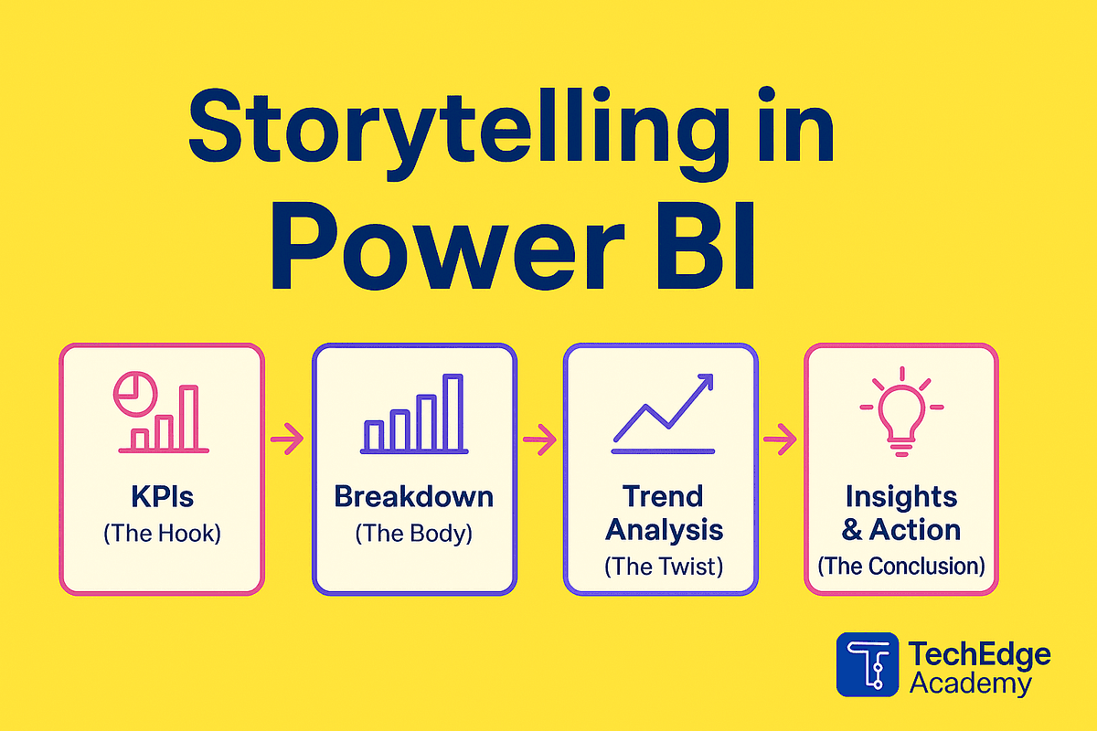
Data Storytelling with Power BI:
Let's be honest for a moment. How many Power BI reports have you seen that are simply a collection of charts—a Frankenstein dashboard with 50 KPIs crammed onto a single canvas? Anyone can drag and drop data into a visual. But connecting with your audience, driving decisions, and telling a story? That's where the real magic happens.
What is Data Storytelling (and Why Does It Matter)?
Data storytelling in Power BI isn't just about making your dashboard look pretty. It's about taking raw data, visuals, and a compelling narrative to create an easy-to-understand experience that promotes action. It answers the "so what?" question that stakeholders are always thinking.
Why do traditional dashboards so often fail? They show what happened, but fail to communicate why it matters. We build reports based on assumptions or high-level stakeholder opinions instead of going straight to the end user who will actually use the tool. The result? The report gets binned because it doesn't resonate.
The Golden Rule: The Story Begins Before Power BI
Here’s a powerful truth: Data storytelling doesn’t start in Power BI Desktop. Launching the tool before you understand the problem is the #1 mistake.
Step 1: Know Your Audience
This is paramount. Influential people might say, "Give me a report," but they aren't the ones clicking through it daily. Speak to the store managers, the ops staff, the merchandisers—the actual end users. They have specific needs and pain points. If they aren't involved in shaping the story, why would they trust or use the report?
Step 2: Define the Goal, Not Just the Request
Stop asking "What do you want to see?" Start asking "What goal are you trying to achieve, or what challenge are you trying to overcome?" By starting with a measurable goal, you can define success. You know whether you are moving towards or away from that target. This keeps things focused and prevents the dreaded "Frankenstein dashboard" where someone dumps a mess of KPIs onto a canvas.
Step 3: Derive KPIs (Don't Just Copy-Paste)
KPIs are not just numbers; they are part of the story. Once you have defined the core objective, use it to filter out the noise. Are all 50 KPIs really necessary for a single audience? Likely not. Focus on the metrics that answer, "Are we moving towards our goal?"
How to Build a Story with Power BI Features
Once you have the narrative, you can use Power BI to bring it to life.
1. Start with the Big Picture
Use the top-left corner of the canvas for the highest-level data (since we read top to bottom, left to right). Create an executive summary page that hooks the viewer immediately.
2. Smart Narratives
The Smart Narrative visual is a game-changer. It provides a quick, dynamic text summary of your reports and visuals. Instead of pasting a static screenshot into a PowerPoint slide, the Smart Narrative auto-updates as the data refreshes.
-
Page Summary: Select the canvas and click the Smart Narrative icon. Power BI analyzes trends (like revenue growth of 72%) and writes a summary for you.
-
Visual Summary: Right-click any visual and select "Summarize." You can pin this text summary to the report page.
-
Customization: You aren't stuck with the AI-generated text. You can edit it, add "Dynamic Values" (mapped to DAX measures), and format the text to tell the specific story you want. With a Copilot license, you can even use AI to help tailor the narrative.
3. Design with Intent
-
Accentuate: Card visuals are great for displaying important numbers prominently. If everything is the same size, the reader can't focus on what's important.
-
Visual Choice: Avoid 3D charts and pie charts (unless you have less than 8 categories). Bar and column charts are better for comparisons because humans can process side-by-side values more easily.
-
Data Limits: Be aware of data point limits. Power BI reduces data to ensure speed. For example, Bar Charts default to 500 rows via virtualization, while Scatter Charts can push up to 10,000 points. Understanding these limits prevents the visual from missing outliers or key trends.
4. Layered Information
Structure your report in three layers: Headlines (KPIs), Supporting Evidence (trend lines), and Details (drill-through for those who want to dig deeper).
The "Why" vs. The "What"
Imagine you're presenting sales data:
-
Bad: "Monthly Sales: $1.2M, Previous: $1.1M, Change: +9%."
-
Good: "Sales grew 9% this month, driven by our new product line launch in the Northeast region, exceeding projections by 15%."
Which one is your executive going to remember? The narrative gives context. It tells them the "why."
Final Thought
Power BI is an incredibly powerful tool—feature-rich and ever-evolving. But the tool is only as good as the story behind it. Don't jump into the tool too quickly. Spend time with your users, define the goal, and then build the report. Remember, the best data stories aren't just seen—they are remembered and acted upon.
Contact Us
Phone: +91 9667708830
Email: info@codingnow.in
Website: https://codingnow.in/
Address:
2nd Floor, Kapil Vihar (Opp. Metro Pillar No.354)
Pitampura, New Delhi – 110034
Backlink to main website: Explore Python and AI courses at Coding Now – Gurukul of AI
